

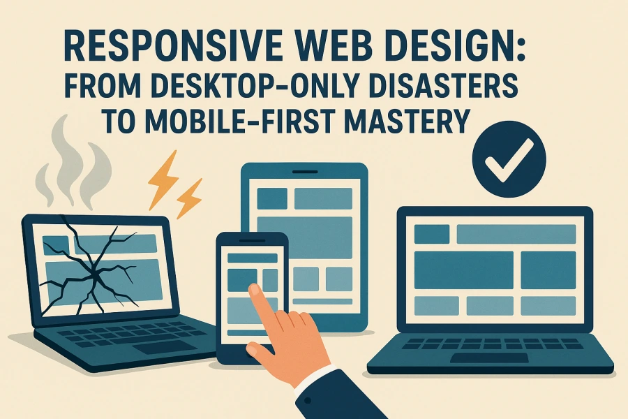
It was my third month at Amazon, and I was tasked with "making the product listing page work on mobile." How hard could it be? I added a few media queries, squished the desktop layout into a smaller viewport, and called it done. The result? A cramped, unusable mess where product images were thumbnail-sized and the "Add to Cart" button required a magnifying glass to tap.
My UX designer took one look at my "responsive" design and said, "Maya, this isn't responsive design - this is desktop design held hostage by a small screen. Let me show you what mobile-first really means." Over the next week, she taught me that responsive design isn't about making things smaller; it's about rethinking the entire user experience for different contexts and capabilities.
That lesson transformed how I approach web design. Since then, I've built interfaces that seamlessly adapt from smartwatches to ultra-wide monitors, and I've learned that truly responsive design is equal parts technical skill and empathetic user experience.
Table Of Contents
- The Desktop-First Disaster
- The Mobile-First Revolution
- Advanced CSS Grid Layouts
- Flexbox for Complex Component Layouts
- Modern CSS Techniques for Responsive Design
- Performance Optimization for Responsive Design
- Testing and Debugging Responsive Design
- Final Thoughts: Responsive Design as User Empathy
The Desktop-First Disaster
Here's what my original "responsive" approach looked like:
<!DOCTYPE html>
<html lang="en">
<head>
    <meta charset="UTF-8">
    <meta name="viewport" content="width=device-width, initial-scale=1.0">
    <title>Desktop-First Disaster</title>
    <style>
        /* Desktop-first approach (the wrong way) */
        .product-listing {
            display: grid;
            grid-template-columns: repeat(4, 1fr);
            gap: 20px;
            padding: 40px;
            max-width: 1200px;
            margin: 0 auto;
        }

        .product-card {
            background: white;
            border: 1px solid #ddd;
            border-radius: 8px;
            padding: 20px;
            box-shadow: 0 2px 8px rgba(0,0,0,0.1);
        }

        .product-image {
            width: 100%;
            height: 200px;
            object-fit: cover;
            border-radius: 4px;
        }

        .product-title {
            font-size: 18px;
            font-weight: bold;
            margin: 15px 0 10px;
            line-height: 1.3;
        }

        .product-price {
            font-size: 24px;
            color: #d73502;
            font-weight: bold;
            margin: 10px 0;
        }

        .product-description {
            font-size: 14px;
            color: #666;
            line-height: 1.5;
            margin: 10px 0;
        }

        .add-to-cart {
            background: #ff9900;
            color: white;
            border: none;
            padding: 12px 24px;
            border-radius: 4px;
            font-size: 16px;
            cursor: pointer;
            width: 100%;
            margin-top: 15px;
        }

        .filters {
            position: fixed;
            left: 0;
            top: 80px;
            width: 250px;
            height: calc(100vh - 80px);
            background: #f8f9fa;
            padding: 20px;
            border-right: 1px solid #ddd;
            overflow-y: auto;
        }

        .main-content {
            margin-left: 270px;
        }

        /* Terrible mobile "fixes" */
        @media (max-width: 768px) {
            .product-listing {
                grid-template-columns: repeat(2, 1fr);
                gap: 10px;
                padding: 10px;
            }

            .product-card {
                padding: 10px;
            }

            .product-title {
                font-size: 14px;
            }

            .product-price {
                font-size: 18px;
            }

            .product-description {
                font-size: 12px;
            }

            .add-to-cart {
                padding: 8px 12px;
                font-size: 14px;
            }

            .filters {
                display: none; /* Just hide it - terrible UX! */
            }

            .main-content {
                margin-left: 0;
            }
        }

        @media (max-width: 480px) {
            .product-listing {
                grid-template-columns: 1fr; /* Everything in one column */
                gap: 5px;
                padding: 5px;
            }

            .product-title {
                font-size: 12px;
            }

            .product-price {
                font-size: 16px;
            }

            .add-to-cart {
                padding: 6px 10px;
                font-size: 12px;
            }
        }
    </style>
</head>
<body>
    <div class="filters">
        <h3>Filters</h3>
        <div class="filter-group">
            <h4>Category</h4>
            <label><input type="checkbox"> Electronics</label>
            <label><input type="checkbox"> Books</label>
            <label><input type="checkbox"> Clothing</label>
        </div>
        <div class="filter-group">
            <h4>Price Range</h4>
            <label><input type="checkbox"> Under $25</label>
            <label><input type="checkbox"> $25 - $50</label>
            <label><input type="checkbox"> Over $50</label>
        </div>
    </div>

    <main class="main-content">
        <div class="product-listing">
            <div class="product-card">
                <img src="product1.jpg" alt="Wireless Headphones" class="product-image">
                <h2 class="product-title">Premium Wireless Headphones with Noise Cancellation</h2>
                <div class="product-price">$199.99</div>
                <p class="product-description">Experience crystal-clear audio with our premium wireless headphones featuring active noise cancellation, 30-hour battery life, and premium comfort padding.</p>
                <button class="add-to-cart">Add to Cart</button>
            </div>

            <div class="product-card">
                <img src="product2.jpg" alt="Smart Watch" class="product-image">
                <h2 class="product-title">Smart Fitness Watch with Heart Rate Monitor</h2>
                <div class="product-price">$299.99</div>
                <p class="product-description">Track your fitness goals with this advanced smartwatch featuring GPS, heart rate monitoring, sleep tracking, and 7-day battery life.</p>
                <button class="add-to-cart">Add to Cart</button>
            </div>

            <!-- More products... -->
        </div>
    </main>
</body>
</html>
The problems with this approach were numerous:
- Tiny touch targets on mobile (buttons became impossibly small)
- Hidden functionality (filters just disappeared on mobile)
- Poor readability (text became microscopic)
- No consideration for mobile context (users might want different information hierarchy)
- Performance issues (loading desktop-sized images and hiding content)
The Mobile-First Revolution
Here's how I completely reimagined the same product listing with a mobile-first approach:
<!DOCTYPE html>
<html lang="en">
<head>
    <meta charset="UTF-8">
    <meta name="viewport" content="width=device-width, initial-scale=1.0">
    <title>Mobile-First Product Listing</title>
    <style>
        /* Mobile-first base styles */
        * {
            box-sizing: border-box;
            margin: 0;
            padding: 0;
        }

        body {
            font-family: -apple-system, BlinkMacSystemFont, 'Segoe UI', Roboto, sans-serif;
            line-height: 1.6;
            color: #333;
            background: #f8f9fa;
        }

        /* Mobile-first layout */
        .header {
            background: white;
            padding: 1rem;
            border-bottom: 1px solid #e0e0e0;
            position: sticky;
            top: 0;
            z-index: 100;
        }

        .search-bar {
            width: 100%;
            padding: 0.75rem;
            border: 1px solid #ddd;
            border-radius: 8px;
            font-size: 16px; /* Prevents zoom on iOS */
        }

        .filter-toggle {
            background: #007bff;
            color: white;
            border: none;
            padding: 0.75rem 1rem;
            border-radius: 8px;
            font-size: 16px;
            margin-top: 0.5rem;
            width: 100%;
            cursor: pointer;
        }

        .filters {
            background: white;
            padding: 1rem;
            border-bottom: 1px solid #e0e0e0;
            display: none; /* Hidden by default on mobile */
        }

        .filters.open {
            display: block;
        }

        .filter-group {
            margin-bottom: 1rem;
        }

        .filter-group h4 {
            margin-bottom: 0.5rem;
            font-size: 14px;
            text-transform: uppercase;
            color: #666;
        }

        .filter-group label {
            display: block;
            margin-bottom: 0.25rem;
            font-size: 16px;
        }

        .filter-group input[type="checkbox"] {
            margin-right: 0.5rem;
            transform: scale(1.2); /* Larger touch targets */
        }

        .product-listing {
            padding: 1rem;
            display: grid;
            gap: 1rem;
            grid-template-columns: 1fr; /* Single column on mobile */
        }

        .product-card {
            background: white;
            border-radius: 12px;
            overflow: hidden;
            box-shadow: 0 2px 8px rgba(0,0,0,0.1);
            display: grid;
            grid-template-areas:
                "image image"
                "title price"
                "description description"
                "button button";
            grid-template-columns: 1fr auto;
            gap: 0.75rem;
            padding: 1rem;
        }

        .product-image {
            grid-area: image;
            width: 100%;
            height: 200px;
            object-fit: cover;
            border-radius: 8px;
        }

        .product-title {
            grid-area: title;
            font-size: 18px;
            font-weight: 600;
            line-height: 1.3;
            color: #333;
        }

        .product-price {
            grid-area: price;
            font-size: 20px;
            font-weight: bold;
            color: #d73502;
            text-align: right;
        }

        .product-description {
            grid-area: description;
            font-size: 14px;
            color: #666;
            line-height: 1.5;
        }

        .add-to-cart {
            grid-area: button;
            background: #ff9900;
            color: white;
            border: none;
            padding: 1rem;
            border-radius: 8px;
            font-size: 16px;
            font-weight: 600;
            cursor: pointer;
            min-height: 44px; /* iOS recommended touch target */
        }

        .add-to-cart:hover {
            background: #e8890d;
        }

        /* Tablet styles (768px and up) */
        @media (min-width: 768px) {
            .header {
                padding: 1.5rem 2rem;
            }

            .search-bar {
                max-width: 400px;
            }

            .filter-toggle {
                display: none; /* Hide toggle button on larger screens */
            }

            .filters {
                display: block !important; /* Always show filters */
                position: fixed;
                left: 0;
                top: 140px;
                width: 280px;
                height: calc(100vh - 140px);
                overflow-y: auto;
                border-bottom: none;
                border-right: 1px solid #e0e0e0;
                padding: 2rem;
            }

            .product-listing {
                margin-left: 280px;
                padding: 2rem;
                grid-template-columns: repeat(2, 1fr);
                gap: 1.5rem;
            }

            .product-card {
                padding: 1.5rem;
            }
        }

        /* Desktop styles (1024px and up) */
        @media (min-width: 1024px) {
            .product-listing {
                grid-template-columns: repeat(3, 1fr);
                max-width: 1400px;
                margin-left: auto;
                margin-right: auto;
                padding-left: 300px;
            }

            .filters {
                width: 300px;
            }

            .product-card {
                transition: transform 0.2s ease, box-shadow 0.2s ease;
            }

            .product-card:hover {
                transform: translateY(-4px);
                box-shadow: 0 8px 24px rgba(0,0,0,0.15);
            }
        }

        /* Large desktop styles (1440px and up) */
        @media (min-width: 1440px) {
            .product-listing {
                grid-template-columns: repeat(4, 1fr);
                max-width: 1600px;
            }
        }

        /* Ultra-wide screens (1920px and up) */
        @media (min-width: 1920px) {
            .product-listing {
                grid-template-columns: repeat(5, 1fr);
                max-width: 2000px;
            }
        }

        /* Dark mode support */
        @media (prefers-color-scheme: dark) {
            body {
                background: #1a1a1a;
                color: #e0e0e0;
            }

            .header, .filters, .product-card {
                background: #2d2d2d;
                border-color: #404040;
            }

            .search-bar {
                background: #404040;
                border-color: #555;
                color: #e0e0e0;
            }

            .product-title {
                color: #e0e0e0;
            }

            .product-description {
                color: #b0b0b0;
            }
        }

        /* High contrast mode support */
        @media (prefers-contrast: high) {
            .product-card {
                border: 2px solid #333;
            }

            .add-to-cart {
                border: 2px solid #000;
            }
        }

        /* Reduced motion support */
        @media (prefers-reduced-motion: reduce) {
            .product-card {
                transition: none;
            }

            .product-card:hover {
                transform: none;
            }
        }

        /* Print styles */
        @media print {
            .filters, .filter-toggle {
                display: none;
            }

            .product-listing {
                margin-left: 0;
                grid-template-columns: repeat(2, 1fr);
            }

            .add-to-cart {
                display: none;
            }
        }
    </style>
</head>
<body>
    <header class="header">
        <input type="text" class="search-bar" placeholder="Search products...">
        <button class="filter-toggle" onclick="toggleFilters()">Filters</button>
    </header>

    <aside class="filters" id="filters">
        <div class="filter-group">
            <h4>Category</h4>
            <label><input type="checkbox"> Electronics</label>
            <label><input type="checkbox"> Books</label>
            <label><input type="checkbox"> Clothing</label>
            <label><input type="checkbox"> Home & Garden</label>
        </div>

        <div class="filter-group">
            <h4>Price Range</h4>
            <label><input type="checkbox"> Under $25</label>
            <label><input type="checkbox"> $25 - $50</label>
            <label><input type="checkbox"> $50 - $100</label>
            <label><input type="checkbox"> Over $100</label>
        </div>

        <div class="filter-group">
            <h4>Rating</h4>
            <label><input type="checkbox"> 4+ Stars</label>
            <label><input type="checkbox"> 3+ Stars</label>
            <label><input type="checkbox"> Any Rating</label>
        </div>
    </aside>

    <main class="product-listing">
        <article class="product-card">
            <img src="https://via.placeholder.com/300x200/0066cc/ffffff?text=Headphones"
                 alt="Wireless Headphones" class="product-image">
            <h2 class="product-title">Premium Wireless Headphones</h2>
            <div class="product-price">$199.99</div>
            <p class="product-description">
                Experience crystal-clear audio with active noise cancellation and 30-hour battery life.
            </p>
            <button class="add-to-cart">Add to Cart</button>
        </article>

        <article class="product-card">
            <img src="https://via.placeholder.com/300x200/cc6600/ffffff?text=Smart+Watch"
                 alt="Smart Watch" class="product-image">
            <h2 class="product-title">Smart Fitness Watch</h2>
            <div class="product-price">$299.99</div>
            <p class="product-description">
                Track your fitness goals with GPS, heart rate monitoring, and 7-day battery life.
            </p>
            <button class="add-to-cart">Add to Cart</button>
        </article>

        <article class="product-card">
            <img src="https://via.placeholder.com/300x200/009900/ffffff?text=Coffee+Maker"
                 alt="Coffee Maker" class="product-image">
            <h2 class="product-title">Programmable Coffee Maker</h2>
            <div class="product-price">$89.99</div>
            <p class="product-description">
                Wake up to freshly brewed coffee with programmable timer and thermal carafe.
            </p>
            <button class="add-to-cart">Add to Cart</button>
        </article>

        <article class="product-card">
            <img src="https://via.placeholder.com/300x200/cc0066/ffffff?text=Yoga+Mat"
                 alt="Yoga Mat" class="product-image">
            <h2 class="product-title">Premium Yoga Mat</h2>
            <div class="product-price">$49.99</div>
            <p class="product-description">
                Non-slip, eco-friendly yoga mat with superior cushioning and grip.
            </p>
            <button class="add-to-cart">Add to Cart</button>
        </article>
    </main>

    <script>
        function toggleFilters() {
            const filters = document.getElementById('filters');
            filters.classList.toggle('open');
        }

        // Close filters when clicking outside on mobile
        document.addEventListener('click', function(event) {
            const filters = document.getElementById('filters');
            const filterToggle = document.querySelector('.filter-toggle');

            if (window.innerWidth < 768 &&
                !filters.contains(event.target) &&
                !filterToggle.contains(event.target)) {
                filters.classList.remove('open');
            }
        });
    </script>
</body>
</html>
Advanced CSS Grid Layouts
Complex Grid Systems with Named Areas
/* Advanced grid layout for different content types */
.dashboard-grid {
    display: grid;
    gap: 1rem;
    padding: 1rem;

    /* Mobile: Stack everything vertically */
    grid-template-areas:
        "header"
        "nav"
        "main"
        "sidebar"
        "footer";
    grid-template-rows: auto auto 1fr auto auto;
}

/* Tablet: Side navigation */
@media (min-width: 768px) {
    .dashboard-grid {
        grid-template-areas:
            "header header"
            "nav main"
            "nav sidebar"
            "footer footer";
        grid-template-columns: 250px 1fr;
        grid-template-rows: auto 1fr auto auto;
    }
}

/* Desktop: Full layout */
@media (min-width: 1024px) {
    .dashboard-grid {
        grid-template-areas:
            "header header header"
            "nav main sidebar"
            "footer footer footer";
        grid-template-columns: 250px 1fr 300px;
        grid-template-rows: auto 1fr auto;
        max-width: 1400px;
        margin: 0 auto;
    }
}

.header { grid-area: header; }
.nav { grid-area: nav; }
.main { grid-area: main; }
.sidebar { grid-area: sidebar; }
.footer { grid-area: footer; }

/* Nested grids for complex layouts */
.article-layout {
    display: grid;
    gap: 2rem;

    /* Mobile: Single column */
    grid-template-columns: 1fr;
}

@media (min-width: 768px) {
    .article-layout {
        /* Tablet: Sidebar */
        grid-template-columns: 1fr 250px;
    }
}

@media (min-width: 1024px) {
    .article-layout {
        /* Desktop: Wide content area */
        grid-template-columns: 1fr 300px;
        max-width: 1200px;
        margin: 0 auto;
    }
}

.article-content {
    display: grid;
    gap: 1.5rem;
    grid-template-columns: 1fr;
}

/* Image galleries with dynamic columns */
.image-gallery {
    display: grid;
    gap: 1rem;

    /* Mobile: 2 columns */
    grid-template-columns: repeat(2, 1fr);
}

@media (min-width: 480px) {
    .image-gallery {
        /* Large mobile: 3 columns */
        grid-template-columns: repeat(3, 1fr);
    }
}

@media (min-width: 768px) {
    .image-gallery {
        /* Tablet: 4 columns */
        grid-template-columns: repeat(4, 1fr);
    }
}

@media (min-width: 1024px) {
    .image-gallery {
        /* Desktop: 5-6 columns based on container */
        grid-template-columns: repeat(auto-fit, minmax(200px, 1fr));
    }
}

/* Auto-fit vs auto-fill demonstration */
.auto-fit-demo {
    display: grid;
    gap: 1rem;
    /* Columns stretch to fill available space */
    grid-template-columns: repeat(auto-fit, minmax(250px, 1fr));
}

.auto-fill-demo {
    display: grid;
    gap: 1rem;
    /* Maintains column size, adds empty columns if space available */
    grid-template-columns: repeat(auto-fill, minmax(250px, 1fr));
}
Dynamic Grid with Container Queries
/* Container queries for truly responsive components */
.product-grid {
    container-type: inline-size;
    display: grid;
    gap: 1rem;
    grid-template-columns: 1fr;
}

/* When container is 400px or wider */
@container (min-width: 400px) {
    .product-grid {
        grid-template-columns: repeat(2, 1fr);
    }
}

/* When container is 600px or wider */
@container (min-width: 600px) {
    .product-grid {
        grid-template-columns: repeat(3, 1fr);
    }
}

/* When container is 800px or wider */
@container (min-width: 800px) {
    .product-grid {
        grid-template-columns: repeat(4, 1fr);
    }
}

/* Subgrid support for aligned layouts */
.card-grid {
    display: grid;
    grid-template-columns: repeat(auto-fit, minmax(300px, 1fr));
    gap: 2rem;
}

.card {
    display: grid;
    grid-template-rows: subgrid;
    grid-row: span 4; /* Image, title, description, button */
    gap: 1rem;
}

/* Masonry-like layout with CSS Grid */
.masonry-grid {
    display: grid;
    grid-template-columns: repeat(auto-fill, minmax(250px, 1fr));
    grid-auto-rows: 10px; /* Small row height for dense packing */
    gap: 1rem;
}

.masonry-item {
    /* Items span multiple rows based on content height */
    grid-row-end: span var(--row-span);
}

/* Calculate row span dynamically with JavaScript */
.masonry-item.small { --row-span: 20; }
.masonry-item.medium { --row-span: 30; }
.masonry-item.large { --row-span: 40; }
Flexbox for Complex Component Layouts
Navigation Systems
/* Responsive navigation with Flexbox */
.main-nav {
    display: flex;
    align-items: center;
    justify-content: space-between;
    padding: 1rem;
    background: white;
    border-bottom: 1px solid #e0e0e0;
}

.nav-brand {
    font-size: 1.5rem;
    font-weight: bold;
    color: #333;
    text-decoration: none;
}

.nav-menu {
    display: flex;
    list-style: none;
    margin: 0;
    padding: 0;
    gap: 2rem;
}

.nav-link {
    color: #666;
    text-decoration: none;
    padding: 0.5rem 0;
    border-bottom: 2px solid transparent;
    transition: all 0.2s ease;
}

.nav-link:hover,
.nav-link.active {
    color: #007bff;
    border-bottom-color: #007bff;
}

.nav-toggle {
    display: none;
    background: none;
    border: none;
    font-size: 1.5rem;
    cursor: pointer;
}

/* Mobile navigation */
@media (max-width: 768px) {
    .nav-menu {
        position: absolute;
        top: 100%;
        left: 0;
        right: 0;
        background: white;
        flex-direction: column;
        padding: 1rem;
        box-shadow: 0 4px 8px rgba(0,0,0,0.1);
        transform: translateY(-100%);
        opacity: 0;
        pointer-events: none;
        transition: all 0.3s ease;
    }

    .nav-menu.open {
        transform: translateY(0);
        opacity: 1;
        pointer-events: auto;
    }

    .nav-toggle {
        display: block;
    }

    .nav-link {
        padding: 1rem 0;
        border-bottom: 1px solid #e0e0e0;
        border-left: none;
    }

    .nav-link:hover,
    .nav-link.active {
        border-bottom-color: #e0e0e0;
        border-left: 4px solid #007bff;
        padding-left: 1rem;
    }
}

/* Breadcrumb navigation */
.breadcrumb {
    display: flex;
    align-items: center;
    gap: 0.5rem;
    padding: 1rem;
    font-size: 0.9rem;
    color: #666;
    overflow-x: auto;
}

.breadcrumb a {
    color: #007bff;
    text-decoration: none;
    white-space: nowrap;
}

.breadcrumb-separator {
    color: #999;
}

.breadcrumb-current {
    font-weight: 500;
    color: #333;
    white-space: nowrap;
}

/* Tab navigation */
.tab-nav {
    display: flex;
    border-bottom: 1px solid #e0e0e0;
    overflow-x: auto;
    scrollbar-width: none;
    -ms-overflow-style: none;
}

.tab-nav::-webkit-scrollbar {
    display: none;
}

.tab-button {
    background: none;
    border: none;
    padding: 1rem 1.5rem;
    font-size: 1rem;
    cursor: pointer;
    border-bottom: 2px solid transparent;
    transition: all 0.2s ease;
    white-space: nowrap;
}

.tab-button:hover {
    background: #f8f9fa;
}

.tab-button.active {
    border-bottom-color: #007bff;
    color: #007bff;
}
Card Layouts and Components
/* Flexible card layouts */
.card-container {
    display: flex;
    flex-wrap: wrap;
    gap: 1.5rem;
    padding: 1rem;
}

.card {
    flex: 1 1 300px; /* Grow, shrink, base width */
    display: flex;
    flex-direction: column;
    background: white;
    border-radius: 12px;
    overflow: hidden;
    box-shadow: 0 2px 8px rgba(0,0,0,0.1);
    transition: transform 0.2s ease, box-shadow 0.2s ease;
}

.card:hover {
    transform: translateY(-4px);
    box-shadow: 0 8px 24px rgba(0,0,0,0.15);
}

.card-media {
    aspect-ratio: 16/9;
    overflow: hidden;
}

.card-image {
    width: 100%;
    height: 100%;
    object-fit: cover;
    transition: transform 0.3s ease;
}

.card:hover .card-image {
    transform: scale(1.05);
}

.card-content {
    flex: 1;
    display: flex;
    flex-direction: column;
    padding: 1.5rem;
    gap: 1rem;
}

.card-title {
    font-size: 1.25rem;
    font-weight: 600;
    line-height: 1.3;
    margin: 0;
}

.card-description {
    flex: 1;
    color: #666;
    line-height: 1.5;
}

.card-actions {
    display: flex;
    gap: 1rem;
    align-items: center;
    justify-content: space-between;
    margin-top: auto;
}

.card-price {
    font-size: 1.25rem;
    font-weight: bold;
    color: #d73502;
}

.card-button {
    background: #007bff;
    color: white;
    border: none;
    padding: 0.75rem 1.5rem;
    border-radius: 8px;
    font-weight: 500;
    cursor: pointer;
    transition: background 0.2s ease;
}

.card-button:hover {
    background: #0056b3;
}

/* Horizontal card layout */
.card-horizontal {
    flex-direction: row;
    max-width: 600px;
}

.card-horizontal .card-media {
    flex: 0 0 200px;
    aspect-ratio: 1;
}

@media (max-width: 480px) {
    .card-horizontal {
        flex-direction: column;
    }

    .card-horizontal .card-media {
        flex: none;
        aspect-ratio: 16/9;
    }
}

/* Featured card layout */
.featured-card {
    flex: 1 1 100%;
    flex-direction: row;
    min-height: 300px;
}

.featured-card .card-media {
    flex: 1 1 50%;
}

.featured-card .card-content {
    flex: 1 1 50%;
    padding: 2rem;
    justify-content: center;
}

@media (max-width: 768px) {
    .featured-card {
        flex-direction: column;
        min-height: auto;
    }

    .featured-card .card-media,
    .featured-card .card-content {
        flex: none;
    }
}
Modern CSS Techniques for Responsive Design
Intrinsic Web Design Patterns
/* Intrinsic sizing with ch units for text content */
.article-content {
    max-width: 65ch; /* Optimal reading width */
    margin: 0 auto;
    padding: 0 1rem;
}

/* Fluid typography with clamp() */
.heading-large {
    font-size: clamp(2rem, 5vw, 4rem);
    line-height: 1.2;
}

.heading-medium {
    font-size: clamp(1.5rem, 4vw, 2.5rem);
    line-height: 1.3;
}

.body-text {
    font-size: clamp(1rem, 2.5vw, 1.125rem);
    line-height: 1.6;
}

/* Fluid spacing with clamp() */
.section {
    padding: clamp(2rem, 8vw, 6rem) clamp(1rem, 4vw, 2rem);
}

.content-gap {
    margin-bottom: clamp(1rem, 3vw, 2rem);
}

/* Aspect ratio containers */
.video-container {
    aspect-ratio: 16/9;
    overflow: hidden;
    border-radius: 12px;
}

.square-container {
    aspect-ratio: 1;
}

.portrait-container {
    aspect-ratio: 3/4;
}

/* Modern CSS logical properties */
.content-block {
    margin-block: 2rem; /* margin-top and margin-bottom */
    margin-inline: auto; /* margin-left and margin-right */
    padding-block: 1rem;
    padding-inline: 1.5rem;
    border-inline-start: 4px solid #007bff; /* left border in LTR, right in RTL */
}

/* CSS custom properties for theming */
:root {
    --color-primary: #007bff;
    --color-secondary: #6c757d;
    --color-success: #28a745;
    --color-warning: #ffc107;
    --color-danger: #dc3545;

    --font-size-base: clamp(1rem, 2.5vw, 1.125rem);
    --font-size-large: clamp(1.25rem, 3vw, 1.5rem);
    --font-size-small: clamp(0.875rem, 2vw, 1rem);

    --spacing-xs: 0.25rem;
    --spacing-sm: 0.5rem;
    --spacing-md: 1rem;
    --spacing-lg: 1.5rem;
    --spacing-xl: 2rem;

    --border-radius: 8px;
    --box-shadow: 0 2px 8px rgba(0,0,0,0.1);
    --transition: all 0.2s ease;
}

/* Dark theme */
@media (prefers-color-scheme: dark) {
    :root {
        --color-primary: #4dabf7;
        --color-text: #e9ecef;
        --color-background: #212529;
        --color-surface: #343a40;
        --box-shadow: 0 2px 8px rgba(0,0,0,0.3);
    }
}

/* High contrast theme */
@media (prefers-contrast: high) {
    :root {
        --color-primary: #0000ff;
        --color-text: #000000;
        --color-background: #ffffff;
        --border-width: 2px;
    }
}

/* Reduced motion */
@media (prefers-reduced-motion: reduce) {
    :root {
        --transition: none;
    }

    * {
        animation-duration: 0.01ms !important;
        animation-iteration-count: 1 !important;
        transition-duration: 0.01ms !important;
    }
}
Advanced Layout Techniques
/* Sticky positioning for navigation */
.sticky-nav {
    position: sticky;
    top: 0;
    z-index: 100;
    background: rgba(255, 255, 255, 0.95);
    backdrop-filter: blur(10px);
    border-bottom: 1px solid rgba(0,0,0,0.1);
}

/* Scroll snap for carousel-like behavior */
.image-carousel {
    display: flex;
    overflow-x: auto;
    scroll-snap-type: x mandatory;
    gap: 1rem;
    padding: 1rem;
    scrollbar-width: none;
}

.image-carousel::-webkit-scrollbar {
    display: none;
}

.carousel-item {
    flex: 0 0 80%;
    scroll-snap-align: start;
    border-radius: 12px;
    overflow: hidden;
}

@media (min-width: 768px) {
    .carousel-item {
        flex: 0 0 60%;
    }
}

@media (min-width: 1024px) {
    .carousel-item {
        flex: 0 0 40%;
    }
}

/* CSS shapes for text wrap */
.shaped-content {
    float: left;
    width: 200px;
    height: 200px;
    margin: 0 2rem 1rem 0;
    shape-outside: circle(50%);
    clip-path: circle(50%);
    background: linear-gradient(45deg, #007bff, #0056b3);
}

/* CSS masks for creative effects */
.masked-image {
    mask: linear-gradient(45deg, black 50%, transparent 50%);
    -webkit-mask: linear-gradient(45deg, black 50%, transparent 50%);
}

/* Modern focus management */
.focus-visible-only {
    outline: none;
}

.focus-visible-only:focus-visible {
    outline: 2px solid #007bff;
    outline-offset: 2px;
}

/* CSS containment for performance */
.performance-container {
    contain: layout style paint;
}

.isolated-component {
    contain: layout;
}
Performance Optimization for Responsive Design
Critical CSS and Loading Strategies
<!DOCTYPE html>
<html lang="en">
<head>
    <meta charset="UTF-8">
    <meta name="viewport" content="width=device-width, initial-scale=1.0">
    <title>Performance-Optimized Responsive Design</title>

    <!-- Critical CSS inlined for above-the-fold content -->
    <style>
        /* Critical styles for initial viewport */
        body {
            margin: 0;
            font-family: system-ui, sans-serif;
            line-height: 1.6;
        }
        .header {
            padding: 1rem;
            background: #fff;
            border-bottom: 1px solid #e0e0e0;
        }
        .hero {
            min-height: 60vh;
            display: flex;
            align-items: center;
            justify-content: center;
            background: linear-gradient(135deg, #007bff, #0056b3);
            color: white;
        }
        .hero-title {
            font-size: clamp(2rem, 5vw, 4rem);
            text-align: center;
        }
    </style>

    <!-- Preload critical resources -->
    <link rel="preload" href="/fonts/system-font.woff2" as="font" type="font/woff2" crossorigin>
    <link rel="preload" href="/images/hero-mobile.webp" as="image" media="(max-width: 768px)">
    <link rel="preload" href="/images/hero-desktop.webp" as="image" media="(min-width: 769px)">

    <!-- Non-critical CSS loaded asynchronously -->
    <link rel="preload" href="/css/styles.css" as="style" onload="this.onload=null;this.rel='stylesheet'">
    <noscript><link rel="stylesheet" href="/css/styles.css"></noscript>
</head>
<body>
    <header class="header">
        <nav class="nav">
            <!-- Navigation content -->
        </nav>
    </header>

    <section class="hero">
        <h1 class="hero-title">Responsive Design Done Right</h1>
    </section>

    <!-- Rest of content loaded after critical rendering path -->
    <main class="main-content">
        <!-- Content that can be progressively enhanced -->
    </main>

    <script>
        // Progressive enhancement for non-critical features
        if ('IntersectionObserver' in window) {
            // Lazy load images below the fold
            const lazyImages = document.querySelectorAll('img[data-src]');
            const imageObserver = new IntersectionObserver((entries) => {
                entries.forEach(entry => {
                    if (entry.isIntersecting) {
                        const img = entry.target;
                        img.src = img.dataset.src;
                        img.classList.remove('lazy');
                        imageObserver.unobserve(img);
                    }
                });
            });

            lazyImages.forEach(img => imageObserver.observe(img));
        }

        // Feature detection for modern CSS
        if (CSS.supports('display', 'grid')) {
            document.body.classList.add('supports-grid');
        }

        if (CSS.supports('(container-type: inline-size)')) {
            document.body.classList.add('supports-container-queries');
        }
    </script>
</body>
</html>
Responsive Image Strategies
<!-- Responsive images with different formats and sizes -->
<picture>
    <!-- WebP format for modern browsers -->
    <source
        srcset="/images/hero-mobile.webp 480w,
                /images/hero-tablet.webp 768w,
                /images/hero-desktop.webp 1200w,
                /images/hero-large.webp 1600w"
        sizes="(max-width: 480px) 480px,
               (max-width: 768px) 768px,
               (max-width: 1200px) 1200px,
               1600px"
        type="image/webp">

    <!-- AVIF format for even better compression -->
    <source
        srcset="/images/hero-mobile.avif 480w,
                /images/hero-tablet.avif 768w,
                /images/hero-desktop.avif 1200w,
                /images/hero-large.avif 1600w"
        sizes="(max-width: 480px) 480px,
               (max-width: 768px) 768px,
               (max-width: 1200px) 1200px,
               1600px"
        type="image/avif">

    <!-- Fallback JPEG for older browsers -->
    <img
        srcset="/images/hero-mobile.jpg 480w,
                /images/hero-tablet.jpg 768w,
                /images/hero-desktop.jpg 1200w,
                /images/hero-large.jpg 1600w"
        sizes="(max-width: 480px) 480px,
               (max-width: 768px) 768px,
               (max-width: 1200px) 1200px,
               1600px"
        src="/images/hero-desktop.jpg"
        alt="Hero image showing responsive design in action"
        loading="lazy"
        decoding="async">
</picture>

<!-- Art direction with different crops -->
<picture>
    <!-- Mobile: Square crop focusing on subject -->
    <source
        media="(max-width: 480px)"
        srcset="/images/portrait-mobile-1x.webp 1x,
                /images/portrait-mobile-2x.webp 2x"
        type="image/webp">

    <!-- Tablet: Landscape crop -->
    <source
        media="(max-width: 768px)"
        srcset="/images/portrait-tablet-1x.webp 1x,
                /images/portrait-tablet-2x.webp 2x"
        type="image/webp">

    <!-- Desktop: Full image -->
    <img
        srcset="/images/portrait-desktop-1x.webp 1x,
                /images/portrait-desktop-2x.webp 2x"
        src="/images/portrait-desktop-1x.jpg"
        alt="Professional portrait"
        loading="lazy">
</picture>
CSS Performance Optimization
/* Use efficient selectors */
.card { /* Good: class selector */ }
.card > .card-title { /* Good: direct child */ }
.card .card-title { /* Okay: descendant */ }
div.card { /* Avoid: element + class */ }
.card div div span { /* Avoid: deep nesting */ }

/* Optimize animations for 60fps */
.smooth-animation {
    /* Only animate transform and opacity for best performance */
    transform: translateX(0);
    opacity: 1;
    transition: transform 0.3s ease, opacity 0.3s ease;
}

.smooth-animation:hover {
    transform: translateX(10px);
    opacity: 0.9;
}

/* Use will-change sparingly and remove when done */
.about-to-animate {
    will-change: transform;
}

.animation-complete {
    will-change: auto; /* Reset after animation */
}

/* Efficient CSS for large lists */
.large-list {
    /* Use containment to limit reflow/repaint scope */
    contain: layout style paint;
}

.list-item {
    /* Use flexbox instead of floats */
    display: flex;
    align-items: center;
    /* Avoid expensive properties in large lists */
    border-bottom: 1px solid #e0e0e0;
}

/* Optimize for different connection speeds */
@media (prefers-reduced-data) {
    .hero {
        background: #007bff; /* Solid color instead of gradient/image */
    }

    .decorative-image {
        display: none; /* Hide non-essential images */
    }
}

/* Battery optimization */
@media (prefers-reduced-motion) {
    * {
        animation-duration: 0.01ms !important;
        transition-duration: 0.01ms !important;
    }
}

/* Print optimization */
@media print {
    .no-print {
        display: none !important;
    }

    .page-break {
        page-break-before: always;
    }

    a[href]:after {
        content: " (" attr(href) ")";
    }

    body {
        font-size: 12pt;
        line-height: 1.4;
        color: black;
        background: white;
    }
}
Testing and Debugging Responsive Design
Browser DevTools Techniques
// Responsive design testing utilities
class ResponsiveDesignTester {
    constructor() {
        this.breakpoints = {
            mobile: 480,
            tablet: 768,
            desktop: 1024,
            large: 1440
        };

        this.currentBreakpoint = this.getCurrentBreakpoint();
        this.setupResizeListener();
    }

    getCurrentBreakpoint() {
        const width = window.innerWidth;

        if (width < this.breakpoints.mobile) return 'small-mobile';
        if (width < this.breakpoints.tablet) return 'mobile';
        if (width < this.breakpoints.desktop) return 'tablet';
        if (width < this.breakpoints.large) return 'desktop';
        return 'large-desktop';
    }

    setupResizeListener() {
        let resizeTimer;

        window.addEventListener('resize', () => {
            clearTimeout(resizeTimer);
            resizeTimer = setTimeout(() => {
                const newBreakpoint = this.getCurrentBreakpoint();
                if (newBreakpoint !== this.currentBreakpoint) {
                    this.onBreakpointChange(this.currentBreakpoint, newBreakpoint);
                    this.currentBreakpoint = newBreakpoint;
                }
            }, 250);
        });
    }

    onBreakpointChange(oldBreakpoint, newBreakpoint) {
        console.log(`Breakpoint changed: ${oldBreakpoint} → ${newBreakpoint}`);
        document.body.dataset.breakpoint = newBreakpoint;

        // Trigger custom event for other components
        window.dispatchEvent(new CustomEvent('breakpointChange', {
            detail: { oldBreakpoint, newBreakpoint }
        }));
    }

    // Test responsive images
    testResponsiveImages() {
        const images = document.querySelectorAll('img[srcset], picture');

        images.forEach((img, index) => {
            const rect = img.getBoundingClientRect();
            const displaySize = Math.round(rect.width);
            const actualSize = img.naturalWidth || 'loading...';

            console.log(`Image ${index + 1}:`, {
                displaySize: `${displaySize}px`,
                actualSize: `${actualSize}px`,
                efficiency: actualSize !== 'loading...' ?
                    `${Math.round((displaySize / actualSize) * 100)}%` : 'N/A'
            });
        });
    }

    // Test touch targets
    testTouchTargets() {
        const interactiveElements = document.querySelectorAll(
            'button, a, input, select, textarea, [tabindex], [onclick]'
        );

        const minTouchTarget = 44; // iOS recommendation
        const smallTargets = [];

        interactiveElements.forEach(element => {
            const rect = element.getBoundingClientRect();
            const size = Math.min(rect.width, rect.height);

            if (size < minTouchTarget) {
                smallTargets.push({
                    element,
                    size: Math.round(size),
                    recommended: minTouchTarget
                });
            }
        });

        if (smallTargets.length > 0) {
            console.warn('Touch targets smaller than 44px found:', smallTargets);
        } else {
            console.log('✅ All touch targets meet size requirements');
        }

        return smallTargets;
    }

    // Test color contrast
    async testColorContrast() {
        // This would integrate with accessibility testing tools
        const textElements = document.querySelectorAll('p, h1, h2, h3, h4, h5, h6, span, div');
        const contrastIssues = [];

        textElements.forEach(element => {
            const styles = getComputedStyle(element);
            const color = styles.color;
            const backgroundColor = styles.backgroundColor;

            // In a real implementation, you'd calculate actual contrast ratio
            // This is simplified for demonstration
            if (color === backgroundColor) {
                contrastIssues.push(element);
            }
        });

        console.log(`Found ${contrastIssues.length} potential contrast issues`);
        return contrastIssues;
    }

    // Simulate different connection speeds
    simulateSlowConnection() {
        const images = document.querySelectorAll('img[data-src]');

        images.forEach(img => {
            // Simulate slow loading
            setTimeout(() => {
                img.src = img.dataset.src;
                img.classList.add('loaded');
            }, Math.random() * 3000 + 1000);
        });

        console.log('Simulating slow connection for lazy-loaded images');
    }
}

// Initialize testing
const responsiveTester = new ResponsiveDesignTester();

// DevTools console helpers
console.log('📱 Responsive Design Testing Tools Available:');
console.log('• responsiveTester.testResponsiveImages() - Test image efficiency');
console.log('• responsiveTester.testTouchTargets() - Check touch target sizes');
console.log('• responsiveTester.testColorContrast() - Find contrast issues');
console.log('• responsiveTester.simulateSlowConnection() - Test slow loading');

// Viewport size display
function showViewportInfo() {
    const info = {
        viewport: `${window.innerWidth} × ${window.innerHeight}`,
        screen: `${screen.width} × ${screen.height}`,
        devicePixelRatio: window.devicePixelRatio,
        orientation: screen.orientation?.type || 'unknown'
    };

    console.table(info);
}

// CSS feature detection
function detectCSSFeatures() {
    const features = {
        'CSS Grid': CSS.supports('display', 'grid'),
        'CSS Flexbox': CSS.supports('display', 'flex'),
        'CSS Container Queries': CSS.supports('container-type', 'inline-size'),
        'CSS Subgrid': CSS.supports('grid-template-columns', 'subgrid'),
        'CSS aspect-ratio': CSS.supports('aspect-ratio', '16/9'),
        'CSS clamp()': CSS.supports('width', 'clamp(1rem, 2vw, 3rem)'),
        'CSS logical properties': CSS.supports('margin-inline', '1rem')
    };

    console.table(features);
}

// Media query testing
function testMediaQueries() {
    const queries = [
        '(max-width: 480px)',
        '(max-width: 768px)',
        '(max-width: 1024px)',
        '(prefers-color-scheme: dark)',
        '(prefers-reduced-motion: reduce)',
        '(prefers-contrast: high)',
        '(hover: hover)',
        '(pointer: coarse)'
    ];

    const results = {};
    queries.forEach(query => {
        results[query] = window.matchMedia(query).matches;
    });

    console.table(results);
}

// Add keyboard shortcuts for testing
document.addEventListener('keydown', (e) => {
    if (e.ctrlKey || e.metaKey) {
        switch(e.key) {
            case '1':
                e.preventDefault();
                showViewportInfo();
                break;
            case '2':
                e.preventDefault();
                detectCSSFeatures();
                break;
            case '3':
                e.preventDefault();
                testMediaQueries();
                break;
            case '4':
                e.preventDefault();
                responsiveTester.testTouchTargets();
                break;
        }
    }
});

console.log('🔧 Keyboard shortcuts:');
console.log('• Ctrl/Cmd + 1: Show viewport info');
console.log('• Ctrl/Cmd + 2: Detect CSS features');
console.log('• Ctrl/Cmd + 3: Test media queries');
console.log('• Ctrl/Cmd + 4: Test touch targets');
Final Thoughts: Responsive Design as User Empathy
That cramped mobile disaster at Amazon taught me that responsive design isn't a technical checkbox - it's about empathy. Every viewport size represents a different user context, a different environment, and a different set of capabilities and constraints.
The key insights that transformed my approach to responsive design:
- Mobile-first isn't just about screen size - it's about designing for constraints and progressively enhancing
- Performance is a feature - responsive design must be fast on all devices and connections
- Accessibility is foundational - responsive design should work for everyone, regardless of ability
- Context matters - mobile users might have different goals than desktop users
- Test on real devices - emulators are helpful, but nothing beats real-world testing
Whether you're building a simple blog or a complex web application, responsive design principles will ensure your users have a great experience regardless of how they access your content. The web is for everyone, and responsive design is how we make that promise real.
Remember: responsive design isn't about making things smaller - it's about making them better.
Currently writing this from Victrola Coffee on Capitol Hill, where I'm testing a responsive dashboard design on my phone, tablet, and laptop simultaneously while enjoying my usual cortado. Share your responsive design wins @maya_codes_pnw - we've all had those moments when everything finally clicks across all devices! 📱💻☕
Add Comment
No comments yet. Be the first to comment!